Aesthetic & Functional Habit Tracker Spread Ideas
Let’s talk about habit trackers: a staple in our monthly bullet journal set-ups. Whether you have a love/hate relationship with habit trackers or use the same habit tracker journal spread each month, I hope this blog post can lend some inspiration!
Hey you, would you rather watch and listen than read? Be sure to click the video below!
Why do we track our habits in our journals?
Hello friends! This is Sian or @perceivegrace, on both Instagram & Youtube. I cannot think of a more classic bullet journal spread or layout (other than the calendar or cover page of course) than the habit tracker spread. Habit tracking can be as dimensional or in-depth as you need it to be for the year, month, week, or day. For the sake of this blog post, I’ll be focusing on monthly habit tracking spread ideas.
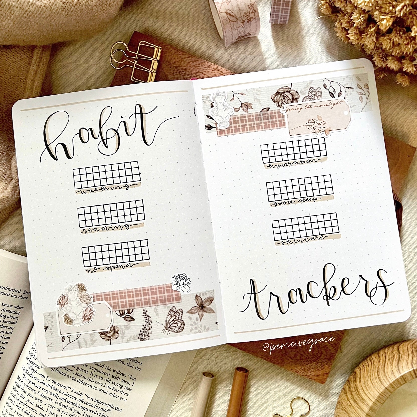
I view habit tracking as a way to refocus or recenter yourself in view of a new month, since habits are simply the routine or practice of our lives. If you feel like you never keep up with your habit tracker spreads you are not alone! I am someone who chronically falls off of using my monthly habit tracking spread by mid-month. I want to emphasize before diving into these ideas, that there should be no pressure or guilt surrounding filling out your habit trackers. Use them as a factual moment in time that you’ve documented in such a way that represents your habits in that month or this month. Like everything else in your journals, you’re archiving these habits along the way and that might mean more to you one month versus another.
Supply List
You can create a habit tracker spread as minimalist or maximalist as you envision (I am definitely maximalist-leaning) so I divided some of the best Archer & Olive supplies below into create versus decorate categories. You can use my code SIAN10 to save 10% with Archer & Olive on the tools you need.
Create:
Decorate:
Full page versus Half Page
Whether this is an aesthetic decision or a functional one the first consideration is will your monthly habit tracker spread be half page or full page this month. Full page is always super fun and more photogenic in my opinion, especially if you share your journal spreads on social media, but you might have another spread that will only get a half page, and as you’re planning your pages before you create them you realize it makes sense to have it facing your habit trackers. I’ve done this in the past primarily with either a goals half page or a playlist half page. You might be trying to save space with this decision and/or you think it just looks nicer.
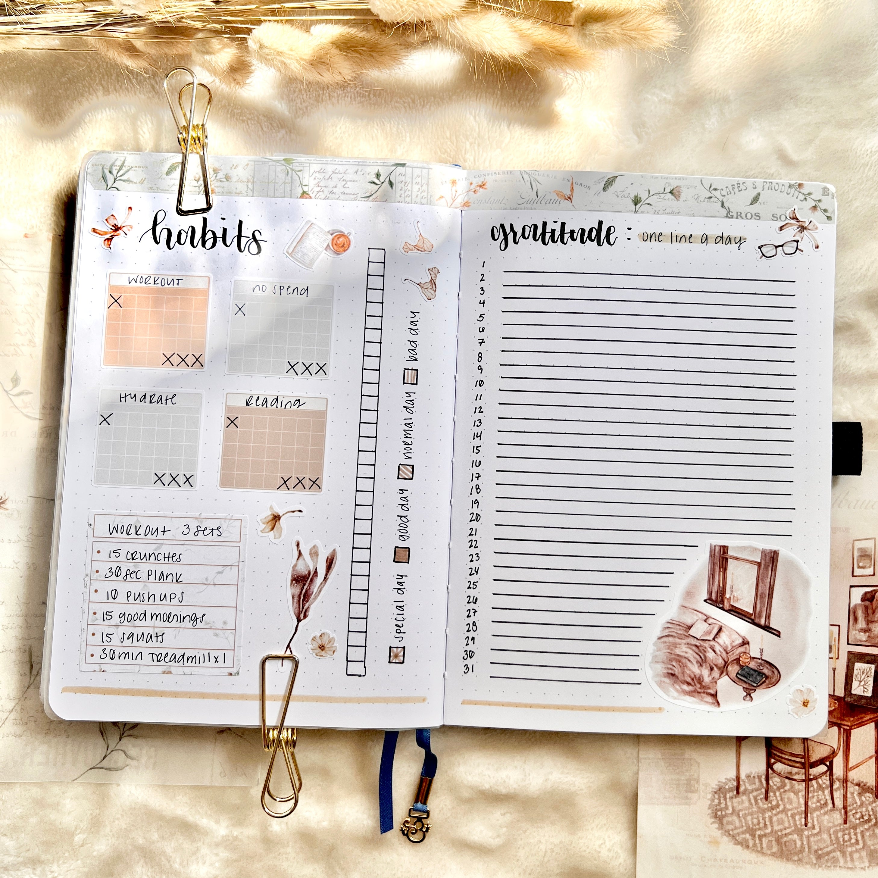
Prioritize a Habit
Your habit tracker spread layout this month might depend on a certain habit you wish to prioritize over the others in a way that involves more than checking off something. For example you could simply check off that you got 6+ hours of sleep each night throughout the month, but maybe it’s more important to you this month to track exactly HOW many hours you got each night or if you woke up at all in the night. Most people achieve this line-graph style with either the number of hours (i.e. 1-12) on one of the axes or a duration of hours (i.e. from 7pm - 10 am). Then the rest of your habits, which you don’t need any more information on other than if you completed the habit or not, go into a separate table or even into more of the traditional calendar shaped box habit trackers.
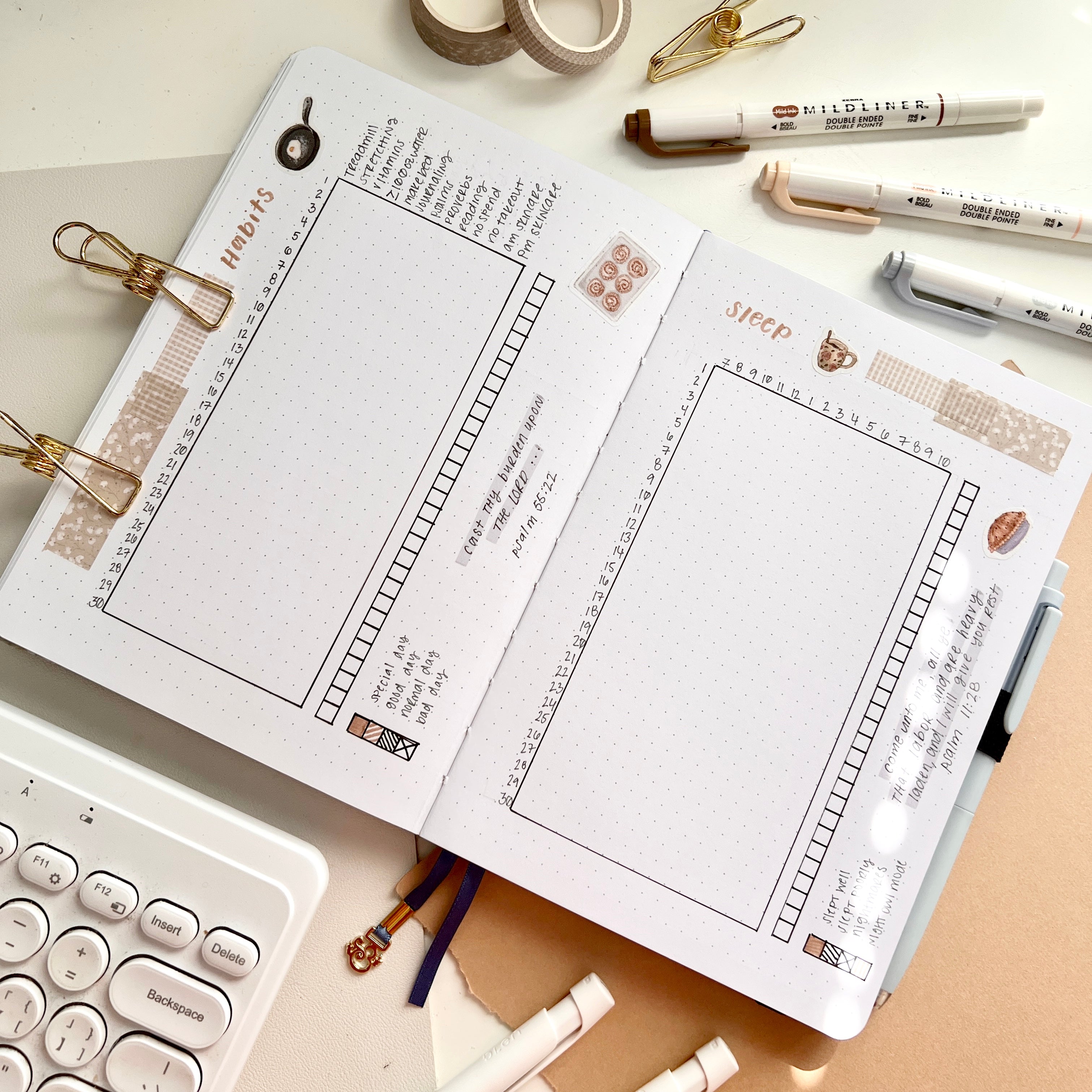
Maybe you want to prioritize your steps for the month and instead of simply tracking if you hit >5k or 10k steps that day you want to track exactly how many steps you took each day. A simple 1x1 table suffices amidst the rest of your habits as seen below.

Hmm? Hand-drawn calendars or Stickers?
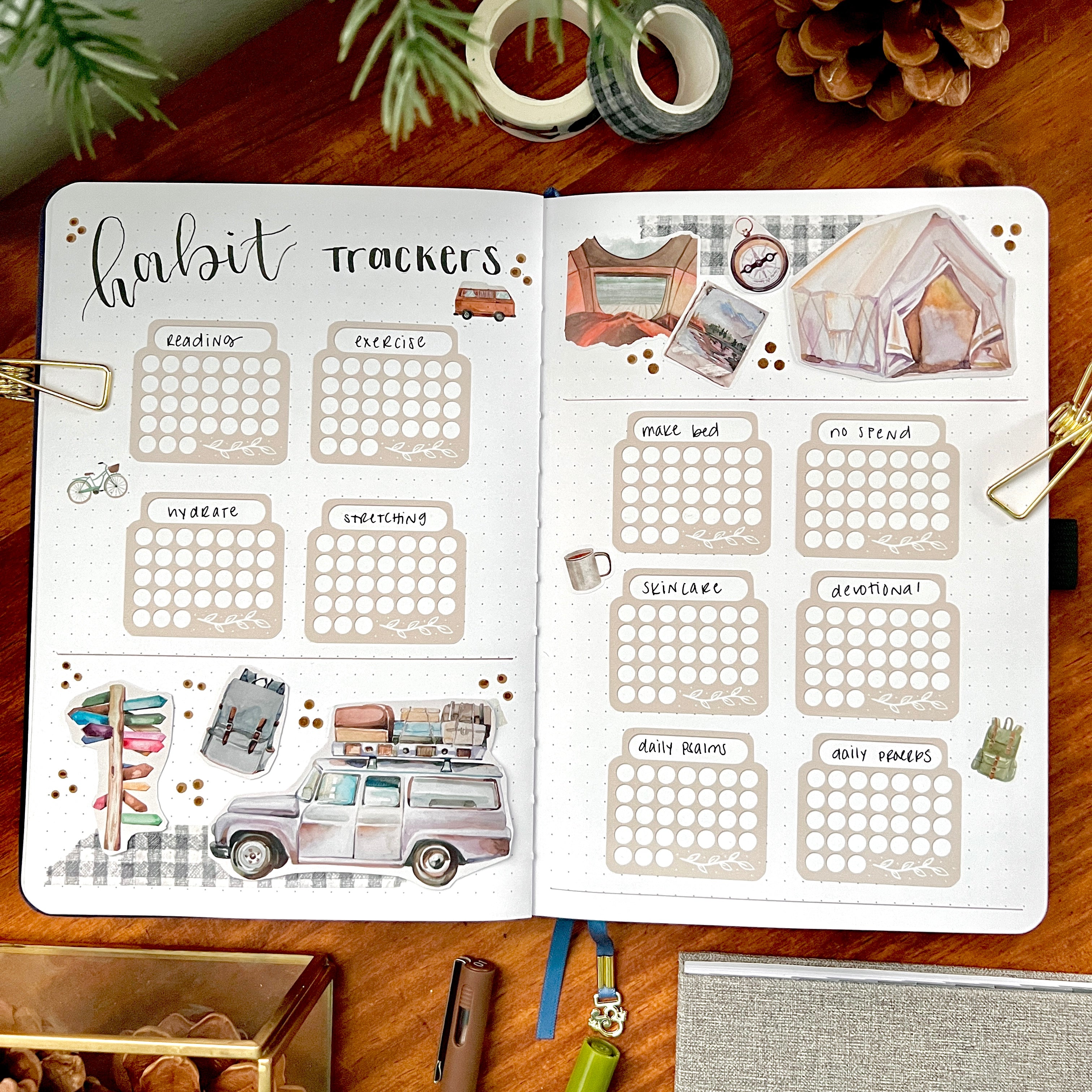
The most basic way to track a habit is to check it off on a calendar box or shape designated to that habit. Whether you hand-draw these or use functional stickers could be a stylistic decision or simply dependent on your resources/preparation for creating your set-up. If you don’t have habit tracker stickers around you could always use dot grid paper from either the neon or pastel notepads and cut the boxes to a mini calendar shape and so on. This will definitely add dimension to your spread. So yes this consideration is mostly an aesthetic one but who doesn’t love a good sticker? This might also be a good time to mention that the full spread calendar boxes layout is definitely my favorite habit tracker spread style.
Compact or Spacious?
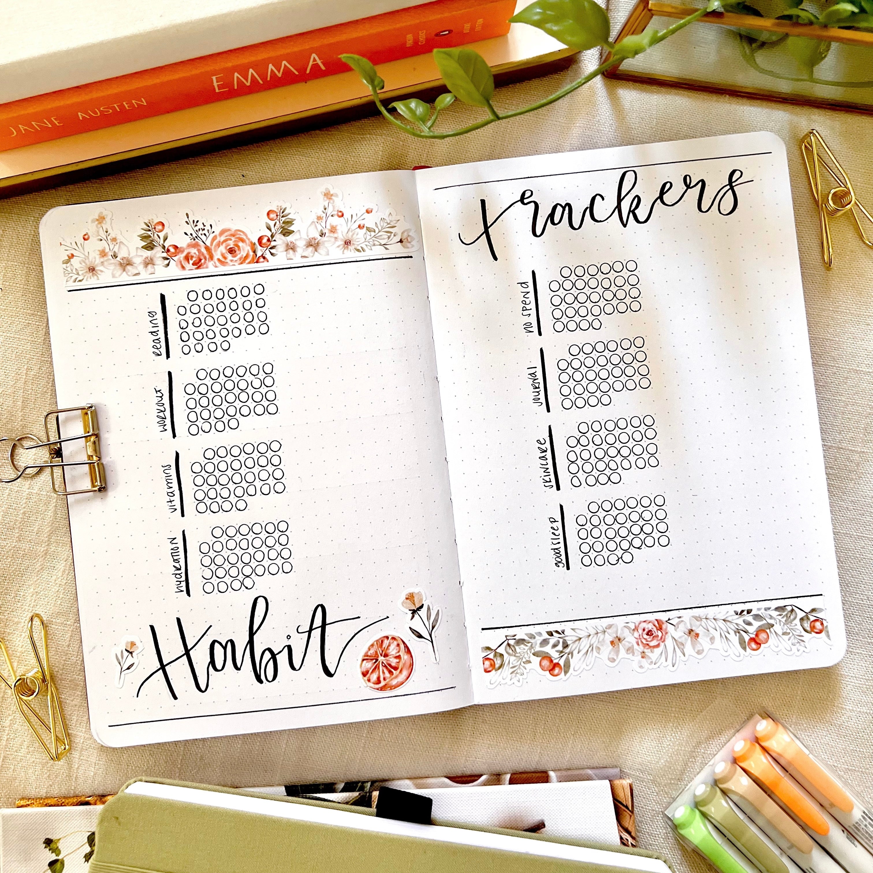
Right away, one habit tracker spread layout idea I have seen a ton of before but have not tried myself is the circle habit tracker spread. Although I don’t have an example to share in my own bullet journals, I did include this layout offered below!
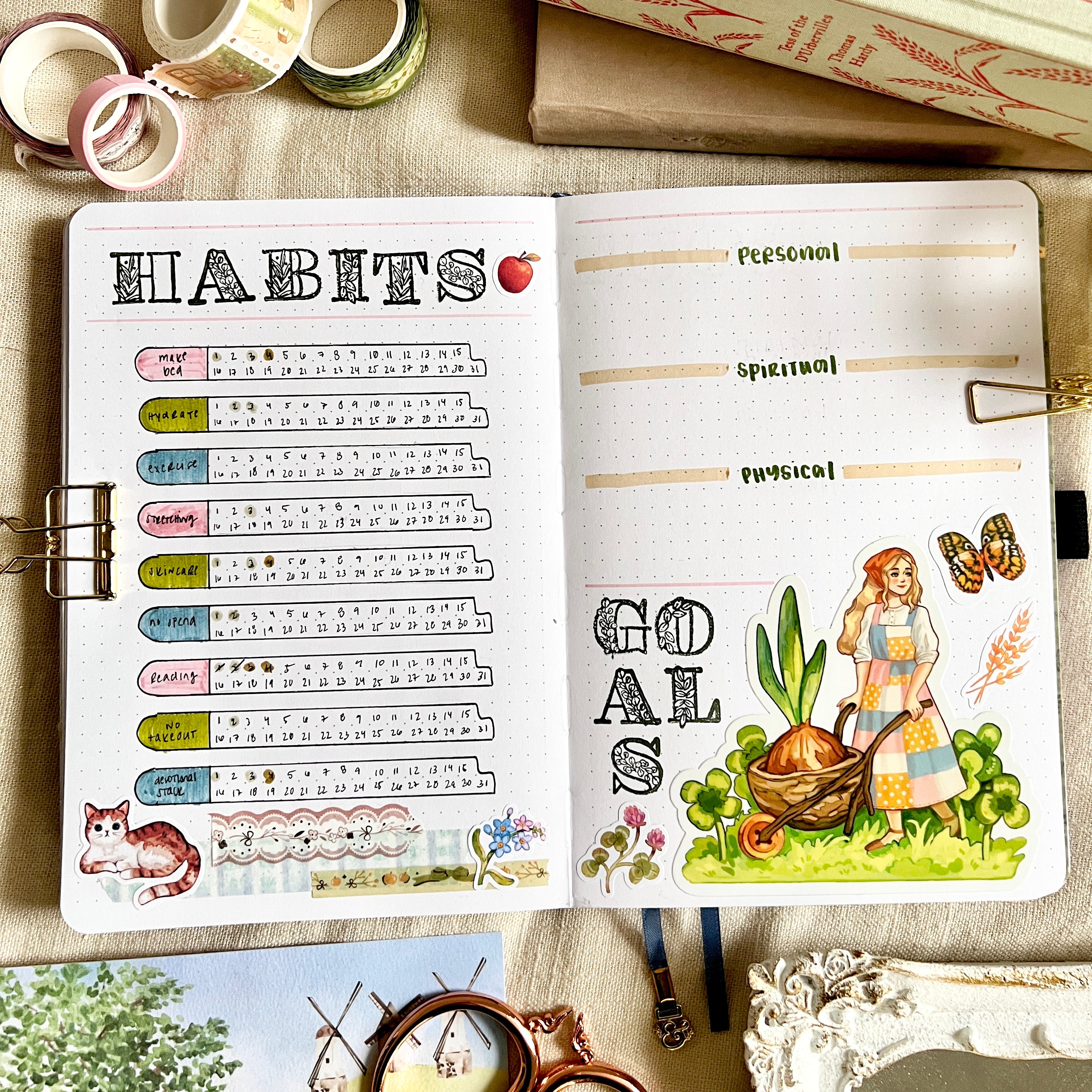
We’ve seen a few spacious habit tracker shapes throughout this blog post but I wanted to note the more compact shape you see in the spread below. This is certainly a great idea if you have several habits you’re interested in tracking for the month OR only have a couple of habits and want to use the rest of the half page spread for other things like a workout plan or other habit-related items that aren’t necessarily tracked.
As always, there are many more ideas out there and I encourage you to experiment with different layouts, for aesthetic or functional reasons!


