18 Ways To Decorate a Weekly Spread In Your Bullet Journal
Hi, friends! It’s Char here from the Archer & Olive 2022 Design Team, and today we’re talking weekly spreads!
Weekly spreads are exactly what they sound like: a place to lay out your tasks, events and appointments for each week. These are probably one of the most common types of spreads you’ll find in a bullet journal setup (although everyone does them a little bit differently), and today I’m going to share some ideas to get you inspired to have fun with yours.

Supplies For A Bullet Journal Weekly Spread
Below is a rundown of some of the products I used to create this spread. If you would like to purchase any of these products, remember to use the code CHAR10 at checkout to save yourself some money!
- A5 Neapolitan Time for Tea Dot Grid Notebook - This journal has 3 different types of paper so that you can pick your favourite between Kraft, Blackout, or regular white pages. You can also do this spread on one of the Dot Grid Notepads, or on any of the other Dot Grid Journals.
- Acrylic Stamps (Fall Planner) - These stamps are an amazing way to save some time on your weekly setup, and they look super cute too!
- Calliographs - I used the Sky Blue Colour from the Jewel Collection to add pops of colour to this spread.
Video
Choose a Theme
This step is totally not necessary, but is a personal favourite of mine. I love choosing one theme per month to unify all of my weekly spreads (for example, doing a holiday theme throughout the month of December).
I love setting a theme because it allows me to express what I’m feeling excited about that month (like a season, an event, or something else that inspired me). Setting one theme for the whole month can also help you feel less overwhelmed with trying to come up with something completely new every week!
Here are some examples of themes you can incorporate into your next weekly spread:
Theme Idea No.1: The show you’re binging right now
If you’ve been following me for a while, you know that one of my most common sources of inspiration for my spreads is TV and movies! I love getting inspiration from the sets, characters, costumes, and even the lettering of the shows that I’m watching, and I find it translates super well into weekly spreads.
WandaVision
My WandaVision theme was one of my absolute favourites this year. There were so many visual references to pull from with this show that I almost wished the month had been longer so that I could have done more of these weekly spreads!

(Image caption: via @chardangerfield.art on Instagram)
Squid Game
As we all know, Squid Game was another massive show this year that made for such a fun theme for my weekly spreads in October. I love trying to showcase one particular, impactful moment or scene with each weekly spread!

(Image caption: via @chardangerfield.art on Instagram)
FRIENDS
One of my all-time favourite shows: this was a theme I had actually already done a few years ago and re-visited again after the reunion came out this year! I love how even when you may think you’ve exhausted all of your options, new inspiration can hit you at any time.

(Image caption: via @chardangerfield.art on Instagram)
Theme Idea No. 2: Keep it minimal
If you have a busy week (or a busy month) ahead of you, the last thing you’ll want to do is spend hours setting something up just to remind yourself how much more work you have to get done. You can totally keep things simple with a quick and easy theme just based around a single colour, font, or doodle. Here are some examples of some of my more minimal (albeit less common for me) spreads:
Bold Acrylograph Print
This may not look minimal to some of you, but I promise for me it was! Just letting the bold colours of the Acrylographs shine in this spread made the rest of my job easy.

(Image caption: via @chardangerfield.art on Instagram)
Clean and Simple
Sticking with one or two colours and one or two fonts is a great way to quickly build a very cohesive vibe for your weekly spread. Here’s an example of a very simple weekly spread I did a few years ago that anyone can re-create!

(Image caption: via @chardangerfield.art on Instagram)
Choose your Layout
Once you’ve chosen your theme, the next step is to decide on a layout. I would say that for me, this step is equally - if not more - important than choosing the theme. Choosing your layout is partly about making it look good, but it’s also about functionality. Here are a couple common types of layouts you can incorporate into your next weekly spreads:
Standard Day-By-Day Layout
These are probably one of the most common types of layouts, and are more or less how I started with my Bullet Journaling journey. These spreads essentially show you your whole week at a glance, and keep your events and tasks in the same place. You can still play around with how these look, but the functional structure more or less stays the same.
These are ideal if you like to assign specific tasks to specific days, and you don’t mind having your events and tasks in the same place. Most people who use these will use some sort of iconography to determine which items listed under each day are events or appointments (I always used a triangle) and which are tasks to be completed (I used to use a square).
Like I said, these can still look very different, even if the function is the same, so here are some examples the variation between my own versions of these types of spreads:
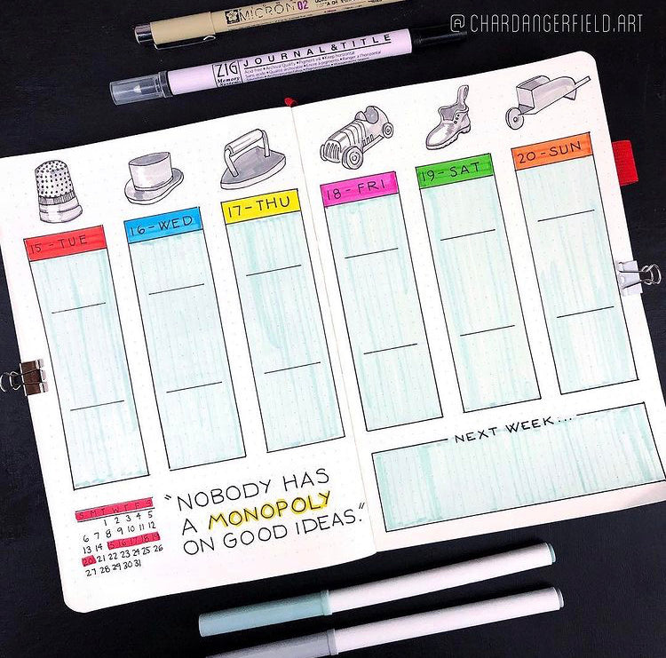
These are more structured (generally boxed off) sections to split up your week. Probably most similar to what you would find in a pre-filled planner or agenda - but still lots of room to incorporate your theme and doodles!

(Image caption: via @chardangerfield.art on Instagram)

(Image caption: via @chardangerfield.art on Instagram)

(Image caption: via @chardangerfield.art on Instagram)
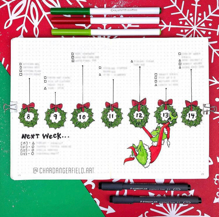
These are not for everyone, as they definitely have a lot less structure. That being said, it can give you a lot more freedom and creativity with how you incorporate illustrations or other decorative elements.

(Image caption: via @chardangerfield.art on Instagram)

(Image caption: via @chardangerfield.art on Instagram)

(Image caption: via @chardangerfield.art on Instagram)
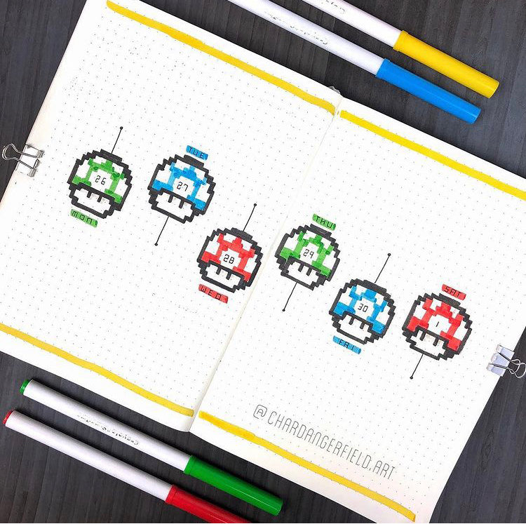
I had a love affair with these spreads for a few solid years! They can look super cute and be a really fun way to incorporate a theme into your weekly spreads.

(Image caption: via @chardangerfield.art on Instagram)

(Image caption: via @chardangerfield.art on Instagram)

(Image caption: via @chardangerfield.art on Instagram)
Separate Weekly Tasks/Events Layout
Over the course of my journaling journey, I learned that this type of weekly spread works best for me. Rather than having everything nested in the same day, I love keeping my weekly events completely separate, and prefer to have a rolling to-do list for my weekly tasks. Here’s what that can look like:

(Image caption: via @chardangerfield.art on Instagram)

(Image caption: via @chardangerfield.art on Instagram)

(Image caption: via @chardangerfield.art on Instagram)
Printable:
To get you started on your own Weekly Spread, I’ve created a printable of some of the things you can decorate your weekly spread with once you’ve got your structure on lock.
Conclusion
Like I said: everyone does these a little bit differently, so play around, experiment and figure out what works best for you. As with everything creative, don’t feel pressured to do these in any particular way if it’s not serving you. I’ve gone through a long journey to find what works best for me, and I’m open to the idea that what that may continue to change in the future!
If you’d like to see more of my spreads, you can find me on Instagram at @chardangerfield.art.
Don’t forget to tag @archerandolive, @archerandolive.community, #AOShare and #archerandolive when you try your own weekly spreads. See you next time!


