10+ Tips to Spice Up Your Bullet Journal Spreads
Hello Friends! I’m Dano from @danosbujo on Instagram and Youtube! Today I’ll be sharing some Tips that I personally use to spice up my spreads, I love making simple spreads but sometimes I see that my bujo needs a little bit of *Spice* on it’s pages. So, Here’s what I do during these times XD.
These tips are simple and easy to make, you do not need to be artistic or have a certain Spread to use these tips, so feel free to get inspired by some of the tips <3
Here’s what I used for this Post:
- A5 Neapolitan Notebook (I love the different colored paper ^^)
- Some Calliographs
- Black waterproof fineliners (I used the Sakura Micron in 01 and the tombow fudenosuke brush pen in black)
- Stickers!!!! They are a fun add up!
- Metalic Acrylographs (I only used gold)
- White Gel Pen from the December Subscription Box
- Washi Tape! (I used the ones from the Messy & Bright Holliday Box and one washi more vintagey from aliexpress)
In case you want to get something from Archer & Olive remember to use my affiliate link and code DANOSBUJO10 for a 10% discount!
Tip 1: Make Illustrations or Doodles

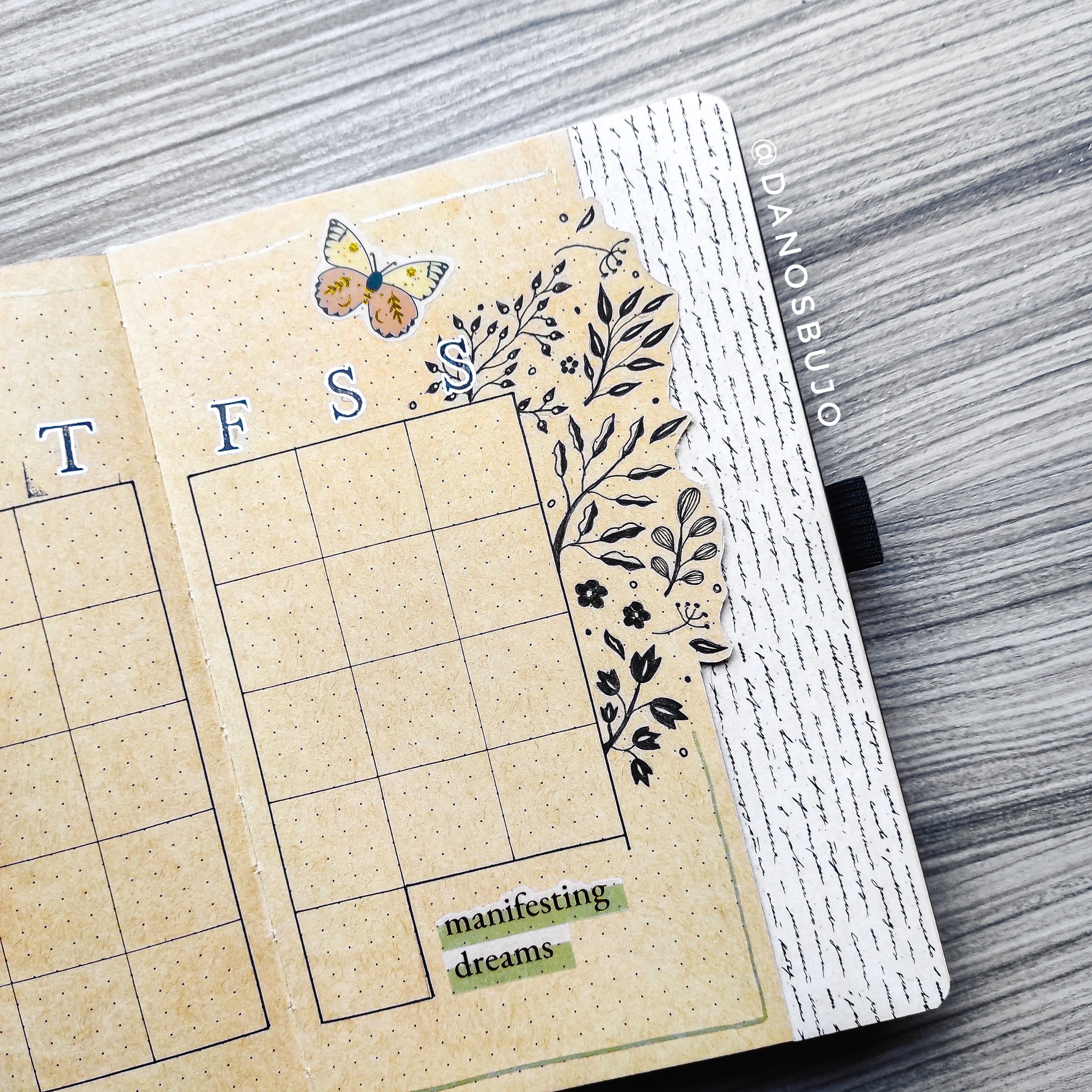
The first tip is to add doodles to your spreads. Here I was inspired by Bonnie's illustrations and decided to draw some leaves behind the calendar. Adding small doodles or illustrations can bring some details to your spread that really makes them pop on your pages.
Tip 2: Add Calligraphy or Lettering

The second tip is to do calligraphy or lettering, having that nice hand touch to your spread is always beautiful and in case you don’t know how to do calligraphy or lettering, just have fun writing in a different way, for example using all letters in caps.
Tip 3: Use Stamps
Using Stamps is always a great way to spice up your spreads. I personally use a lot of my alphabet stamps and it brings the vintage aesthetic touch that I adore!
Tip 4: Outline the letters of the Words
Another great tip is to make outlines around the words/letters/quotes, in my case I stamped one of the S’s on top of an illustration and to make that letter appear and pop on the page, I did a white outline around the stamp, and look how pretty it turned out!
Tip 5: Make a Dutch Door

Tip number 5 is to make a dutch door, Dutch doors are always great add ups to your pages, and they surely spice up your spreads! I love making them a lot!
Tip 6: Make an outlined Dutch Door
You can do an outlined dutch door, I cutted this dutch door around the leaf illustrations, that I made at the beginning, and it created a fun visual type of dutch door, and I absolutely loved it! Be carefull when you create your dutch doors so you don’t cut yourself!
Tip 7: Add Stickers
For tip number 7 is to use stickers, stickers are amazing add ups to spice your spreads and they are easy to use. I used the Magic of Fall stickers.
Tip 8: Add Quotes

For tip number 8 I suggest you add a quote, here I used a quote that says, “manifesting dreams”from the Magic of Fall stickers.
Tip 9: Add a Border around the Page
For tip number 9 I bring you my favorite touch, which is making a border around the pages. I love adding these borders on my spreads and it fills the blank page around my spreads making them more connected and cozier in some sort of way.
Tip 10: Add Washi Tape

For number 10, I bring you washi tape, adding washi tape is always a great idea to spice up your spreads and I love using it whenever I can.
Tip 11: Use the Washi Tape as Headers
Tip number 11 is to use the washi tape as headers, it’s different yet very beautiful. Adding different types of washi tapes as headers makes the spread look fun and pretty!
Tip 12: Use different types of Paper
Tip number 12 brings you the world of scrapbooking, and here I used paper to write the names of the days of the week. I love mixing different papers to contrast with the page, in this weekly spread I used the paper to write the names of the weeks.
Tip 13: Add Gold Details
For tip 13 I like to add Gold details on my spreads, It’s a small add to ypur spreads that can make the whole spread look more stunning and shiny!
Tip 14: Create Tabs
As an extra tip that I didn’t include on my own spread example, is to create Tabs, I love using tabs personally for my weekly spreads, but you can use them wherever you want, it doesn’t take to much space and look so pretty if you color the tabs in different colors ^^
Tip 15: Connect your Spreads

This is not really a tip, but more of an advice, if you use this type of dutch door with illustrations, try to connect both pages, here I drew the leaf doodles to connect both spreads and so they look connected on both sides of the Dutch Door.
Check out how I did/used these Tips on a Monthly Calendar and a Weekly Spread plus a Flip Through in this video:
Here’s a Printable that I made with the full list of tips/ideas to spice up your Spreads! I hope you enjoy it ♥
I hope you enjoyed these Tips to Spice up YOUR Bullet Journal Spreads!
If you’d like to check more of my Content check @danosbujo on Instagram and Youtube!
If you Recreate/Use any of these Tips don’t forget to tag me (@danosbujo) and @archerandolive, @archerandolive.community, #AOShare and #archerandolive.
See you next time!
-Dano.


